Monday, 11 June 2018

Show Evaluation

Overall, I believe that our final show was successful in some ways, however, in others let down. Let's begin with the overall communication between us as students and information about what time we needed to be in and set all banners etc up. We were asked to arrive for 2;30 and after eventually getting into Bath, I felt like it was a huge waste of time as all we did for an hour and a half was sit around waiting for the hotel to allow us in later, the only positive there was to this was that we then had an excess of time amount prior to guests being allowed in to set things up and overthink banner and positioning. It was apparent that there was clear communication between the media department and the Apex hotel, which relieved the stress off our shoulders as most information we needed, we could ask Jo, Nick or Steve about, however, the Apex staff were not overly welcoming to us as students, often giving off rude body language and seemed uninterested in us, now I understand that we as a college were kindly donated the space to rent but this should not have compromised the customer service received.

As for how our work was presented, I was hesitant to be enthusiastic about displaying the work on a banner as no concepts were shown to us in terms of how the look would work, so well all assumed that it would look pretty amateur, however once seeing the banners printed I was relieved to see the concept come to life and the idea of a banner was pretty cool to see and something we will later keep forever (although my mum wasn't too happy at the suggestion of me sticking it to a wall in the house). It was such a nostalgic feeling to look at other displays and picking out just how much we have not only grown as people but as artists from concepts pieces to working with clients. Personally, I don't think there would be much to change if I wanted to although the location of choice was ve
ry contrasting to the liberal creatives that we are, the atmosphere of the venue almost damped spirits with its more formal feel and It did not feel like a time for celebration however just mulling around and quietly judging.

For the past two years, I have wanted nothing more for this course to end, I wanted the freeing independence I was promised, in due time, I was given it, however now my time at Bath College is coming to an end, I want to cling to the back of Steves Crocs and not leave, because I don't want to be an adult just yet! Coming into this experience, I felt truly at a very low point in my life, I have made friends for life in this experience and finally learnt the sacred skill of photocopying, I am thankful to be given a chance to be on this course and will not waste a skill I have learnt.

Thursday, 17 May 2018

Evaluation

As a digital publisher, I wanted to create something that would push my knowledge of software use to a new level for my final project. Having a good knowledge of the most common of Adobe programs, I didn't want to do something basic with a simple photoshop or Illustrator so when planning my ideas and the suggestion of an app was put forward, I wanted to jump at the chance to create something I had not done before. I wanted to create an app that I, myself would want to use and so coming up with Snapthat, an app where you could take pictures of clothing or shoes to find UK based suggestions seemed like a strong enough fit. When envisioning this app, I wanted something marketed at my target age range of 18-25 and straight to the point in terms of usage, maintaining a sleek and minimalistic design, as my research suggested, seemed like the best fit, I believe that I executed this well, In terms of influence I had, as most 19-year-olds will tell you, I am heavily involved on social media and I think this is what encouraged my idea. I knew that my app making skills were pretty poor and so I wanted to bulk it out by also designing the marketing for the campaign and the branding of the app, in doing this I could put into practice what I have learnt over the last two years and then push myself further with the app.

I believe that my app has both strengths and weaknesses, due to the limited time frame I have had I feel like the app could look a lot more professional and polished, however, I believe that the app stays true to my original intentions of creating the prototype and I should be less critical of my skill strength considering I did not any skills in apps prior to this project. Another weakness I believe my app has is the fact that I could not fully understand how to get a working camera for it to work via phone, I think this has taken away from the overall professional look of the app prototype, with no straight answers online or tutorials on how to add in the camera, there was not much I could do about it. Another weakness of the app is that is the complex maintenance I had to go through in order for the app to work correctly such as creating small files such as text and having to bring them into Adobe XD, it was hard and I believe that maintaining the app if it was to launch in real life would take a lot of work. I believe that a strength, however, is the fact that the app has working features so I can show examples of the prototype and it fully explains through this medium, it has been very beneficial, another strength to me personally is the is the success of teaching myself Adobe XD through tutorials to great a working prototype. My final two weaknesses were the fact that the app looks too simple and the detail does not look sustainable enough for me to work at the grade I am may have been originally expecting to achieve, as spoke about previously my personal circumstances  had rapidly increased in problems due to this I struggled to manage the workload I wanted to achieve as I found my day to day life more difficult and this jeopardised my quality of work. The final two strengths of the project that I found to be the fact I did a heavy amount of research which turn meant that the experimentation and other work after came pretty easy, the final strength was the fact that my work was coherent together, it has flowed together consistently and all made sense together.

As for the experimentation, I performed a lot of my work on aspects of branding such as font, imagery, layout and design work. All of these elements were considered prior to making the prototype for Snapthat as they all have a character to build into as a brand, I made different forms of experimentation and then displayed them to my focus group as they would be deciding which designs I picked, I wanted to do this because my target audience would be the consumers who would decide if my app could be successful or not and so in giving them the choice, they will know what they like. Experimentation is such a key part of any designing process it really affected how my work developed from different forms of a logo to have a definitive answer for example. My development after securing my designs escalated from there on, I had the ability to make leaps and bounds in my work from having a simple logo to choosing where I would place that logo on my app, looking through my progress blogs which I ensured to do at least twice during each assignment has allowed me to reflect on just how far I have come, from being unsure of my idea to finalised it seems like months ago. With each reflection blog I have done, I always ensured to plan out what my next steps were or how I would build upon the information I had collected and what my plans were to do with it. I found myself falling behind at the beginning, like I found last year, due to the overwhelming amount of work I needed to do, I also believe I procrastinated a lot due to the refusal of believing this would be my final year of school and then I would be an adult (I'm still not over it).

In terms of Snapthat in comparison to another similar type of media, I feel like it is most similar to Screenshop, a competitor I researched into during my research portion of this project. In comparison between the two, I feel like Screenshop caters to a different audience such as middle ages women who like high-end expensive goods in the USA or that is what it likes its celebrity promoters to believe, in comparison to this Snapthat offers a UK alternative which caters to a younger, social media hungry audience who just want to know who or what each other are wearing. Screenshop others a variety of alternatives to what is being scanned, however, as seen in my research, this doesn't always go to plan with some of the alternatives being nothing alike! with Snapthat, it only offers replicas of what is being pictured and if it cant be found for some reason or another, will then only offer alternative items which will be consistent with the image. The other obvious difference between the two apps is the fact that Screenshop is a published app, whereas Snapthat is only a prototype, currently.

Showcasing my app to friends and family felt like a huge relief, to me it meant that I had finalised all I could and was now finished, the feedback I gained was very complimentary but I know it wasn't the best. However, if you do not know much about Adobe then I assume it must seem like a lot to create an app. Creating the app and the research, experimentation and a lot of consideration for small things like a time frame you could advertise in is a lot more time consuming than anything could realise if you want to be through so completing the last hurdle and finishing this app felt great.  My changes/improvements have remained similar throughout, If I could improve this project I would have liked to have polished my design work more and see the prototype of my app through to a strong result, another improvement I would have liked to perform if given the opportunity is to see if my marketing could be successful, such as paying Instagram to upload my advertisement and seeing how much intrest I would have recived, the same could be said for a bus advertisment, by registering the traffic I recieved to the app I could state if the marketing would be successful or not. I also would have liked to work on Snapthats social media, experimenting with promotional photoshoots and other ways to get the brand out there. It is very surreal to look back at my statement of intent and see how far things have progressed, it's like finishing a television series that you have watched until the end, bittersweet. Originally I intended to create an app that would identify garments of clothing and filter through to find the best UK based alternative, I think that I have stuck to my statement of intent really well and although I haven't created work to a quality I am happy with, I have stuck to all of the original intent.


In conclusion, it is very bittersweet to come to the end of this project, something it feels that the department has been talking about since we started two years ago! Opposite to others, I started this FMP very hesitantly and reluctantly, however, over time I feel like my enthusiasm has grown as well as my love for focusing crutches like Red Bull. I have had a huge personal battle going on during this project and sometimes it felt easier to drop out and walk away than continue but through the support of those such as Jo and Ed I have come to push myself and achieve more with every week even if I am deteriorating on the inside. I fell behind a lot, but thanks to the understanding of those in the media department I have committed to something that I can walk away from with my head held high and hopefully a good grade to have for the future even if it is looking pretty bleak for me right now. The outcome of this project has been great in showcasing my current talents as well as learning new ones with new software which I can display in years to come and grow on top of. Overall, I think my project was successful in its own way.


Finishing the app

After sitting down to do more research on the basic knowledge of Adobe XD, I stumbled upon this tutorial which I found to be the best in terms of helping me progress with XD. Since using the tutorial I have managed to complete the basic layout for my app through XD before adding in the bells and whistles of animation and usability. I had previously stated that I wanted to quick time my progress from beginning to end but by the end, a Quicktime of my progress was looking like a feature-length film, Instead, I created a small screen recording for my progress up until this point, this how my flat lay for the app is currently looking; Now that I have created the flat lay and added in details such as a service bar at the top to make the app seem more lifelike, I am going to progress into the prototype of Adobe XD which is considered the more difficult part. For me, this is about upping my skill level from a competent adobe user to a true Adobe student, this will separate my layout plans for the app into a fully functioning prototype.

Prototyping the app was not as difficult as it once seemed, in fact, it was like using any other of the Adobe software. Having now completed the app, I know just what to do and it seems as easy as any of the other software I have completed. In addition to compleeting what can be seen above, I have also added a 'Backstage' Button which when selected, takes a user to the settings or home if they need it. I have created a QuickTime explaining my reasoning behind my design work which you can find here, so I will not repeat myself, however, I am really impressed with the mock-up of the app I have created to a high use level like this. I did not find myself struggling with anything in particular during this process, thanks to the tutorial found above, things were made easy for me and I could make the prototype easily. 

Overall, creating the app really tested my ability as a student to try new software with no prior training in them. Creating Snapthat and the struggles I have faced along with it is something I am really proud of, I am worried that the app is not to a good enough quality as a second year digital publisher but to create an app with no prior knowledge is great in itself.

Modifications

The only modification I needed to make from my focus group feedback was that I needed to change the positioning of Snapthat's slogan as it sits in advertisements; This is the advertisement currently, however, I agree with the feedback and want to change the slogan too, so that the triangle seems more consistant. Changing the slogan and then adding it to a mock Instagram advert gives the advert a new edge which makes the brand seem really consistent.

I am glad someone pointed out the change because otherwise, it would have gone unnoticed and would not have looked as good as it does now. No other changes were suggested to me during my focus group that I would like to take on and use, nor do I feel like there is anything I want to change that this point. I am happy with both of the advertisements I have created now, with the mock bus ad I have proposed to be used for Uni buses. 


I think that the adverts together look really consistent, my only criticism would be that the triangle would not fit around the text of Snapthat on the bus, however, I think it is still a strong advert that looks consistent with the Instagram advert.

Performance monitoring

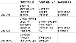
In order to monitor my performance during my production portion of my final project, I have created a spreadsheet which shows the time limitations I have and the number of days. I have already fallen behind schedule due to my experimentation taking longer than anticipated, I have only allowed myself two dedicated days to my production of the app, which I believe is doable because most of the work is already done thanks for my experimentation, now it is just tweaked to my work to make it look professional and changing anything that my focus group feedback to me.

I also intend to do a screencast of my work whilst I am working within Adobe XD to show my progress, I will then edit this together and upload it into a blog where I can explain my process.

Development

I think that my most development has stemmed from my experimentation once my research had been finished, with research not much can be shown accept graphs and quotes taken off of the internet. So far I have progressed from graphs stating that the Apps icon should be black and white to actually creating a rough copy of my apps design. After progressing this far, it is really cool to see just how far I have come in terms of the stepping stones in each key piece of progress.

Other progression I have made is recognising  that some of my research may not have been what I needed in order to progress correctly, for example; Researching into 'Gen Y Not' was not beneficial to me at all, however researching into other competitors of Snapthat was, it allowed to understand just how and why apps such as Instagram are successful in contradiction to my book review which was very biased against my target audience's generation. This was a development to me because I believe that next time I will not pursue research that would clearly not benefit me from the beginning.

Stepping into my recent work during my final project, I have developed the most during my reflection blog posts where I can truly look back and pick out pieces that I would like to change about current, especially during my experimentation that creates most of the ideas I will continue to follow through with. For example; In this blog post, you can see me stating that I prefer my design on the left due to its more professional appearance and so using this information I then proceeded to ensure that my all of my other experimentation pieces looked similar to maintain a good consistency of quality.  Carrying on from this, when it came to my marketing experimentation, I ensured that my reflection work was constant, for me this came in the fact that advertisements on social media can be treated like elevator pitches and you need to sell something quickly with very little given away and so I needed to get a balance right between anonymity and triggering interest;


Overall, I think that my development has been very strong by reflecting on my work and thinking about how I could improve, I will also work with a focus group to confirm any changes but thanks to my reflection blog posts I believe I am happy with my work so far. 


Progression Blog

I feel like I have come on leaps and bounds during my experimentation, not only have I executed my experimentation well and finished some on my designs but I have conducted a focus group to a strong level and received really beneficial feedback on how to improve, which is key. I am slowly coming to the end of my FMP now, with only the apps layout and design to be finalised before Snapthat is completely finished, I think I will struggle during this as I will need to go back to Adobe XD who is quickly becoming my nemesis. However, I need to push forward to ensure I get a good end result which reflects my skills change over the two-year course, If something is to go wrong at least I can reflect on this during my reflection and how I could have changed it.

Feedback from focus group

It was always my intention to create another focus group to gather their feedback from my experimentative designs, I wanted my focus group to be based around my target audience of 18-25-year-olds which had worked well previously and given me some great feedback to work with. This time was no different, although my focus group was smaller, involving the work of my class, I still took some reasonable feedback away to change things. Taking back feedback from my last focus group, I wanted to ask more questions whilst I had the chance which I think did help. The questions I asked were;

I think the questions I asked were a true reflection of all the information I need to finalise my designs, they offered me either the confirmation or changes I needed to make from my designs which were shown on screen to save time and money. Similar to last time, I wrote keynotes to summarise later in this blog post. By explaining my concept and aims of the brand, the class seemed to really understand what I want to achieve, for my probe questions some of the key information I gathered was; 'I think that buses are outdated, however explaining you would only advertise on uni buses is a really good idea' another participant said 'I think that people undermine the idea of advertising on buses, businesses still do it which mean it must work!' another piece of key information I took from my probe questions was that the majority vote to which design for Instagram they preferred was this one;
 Which I am very relieved about as it is also my favourite design which does not need much changing for my finalised designs, one piece of feedback I have taken and will change is that I should swap 'see it' and 'Snap it' so that the triangle will read as 'see it, snap it, buy it' which makes more sense and I agree with that, so I will work with this and change it.

Moving on from my first questions, I wanted to know why the majority vote went to this specific design of Instagram advert. Some of the feedback stated 'it seems mysterious' and 'It looks sleek and professional' which are both positive pieces of feedback to have, after, I asked what my focus group thought about my black and white only colour theme to which all participants said the same 'it looks good' 'it is mature and high fashion' this is what I intended to do so the fact they all saw that is very relieving to know! Following with the positive feedback, after showing the prototype of the app 8/10 said that they would use the app, the 2 who didn't were male so that was disappointing as I wanted to market at them as well and when asked why not, they said its because they're not into fashion enough to want to use the app, which I think is fair. Receiving feedback that is positive is a relieving feeling to have, especially in my design work that is not finalised yet, my work on logo and slogan was also taken positively expect the piece of feedback to change the positioning of text and slogan which I completely agree with and will change during my production process.

My final three questions were my closing questions, questions with no definitive answers. The first question was 'Where do you think Snapthat will struggle' some of the feedback I received was 'If you were to launch this app, fashion apps is such a saturated market that I think you will struggle to be successful' which I would agree with, if my previous research did not disprove this with a majority vote interest in the app. I wanted to know if those in my target audience also believed that this app could be successful, overall the feedback was that If I put all of my time, money and promotion into it it could easily be as successful as other big social media brands, which is a good piece of positive feedback. Finally, my last and closing question was 'which piece of marketing will be least successful and why?' I wanted to know this as my target audience know what they do or don't pay attention to, in a vote 4/10 said they would be less likely to pay attention to an Instagram advert than an advert on the side of a bus, which I think is reasonable. The way Instagram ads sponsored posts in like the posts you may see your following is very clever and eye-catching so I thought it would be the most successful.

It is such a relief to have positive feedback from my target audience from my experimentation, from this focus group not only have my Marketing campaign designs been decided but I know where I may fail but also where I may succeed, which is good to know. Knowing that I have the backing of my target audience is a huge benefit to have as evidence of my success.

Flat-lay Experimentation

For this part of my experimentation, I will be working with Adobe XD, a new software to me. Due to this, I will be watching tutorials first to get my bearings with the app before I begin experimentation with flat lay plans. From my basic understanding, so far it has become apparent to me that I will need to create my work in a different software such as Illustrator or Photoshop and bring the work in, much like the use of InDesign.

I am finding the software a struggle the currently, getting used to the features and different appearance of tools which could be found anywhere within XD,  the one pro to using Adobe XD so far is the fact that the screen size option is very quick and useful to use, allowing Adobe to moderate the app size is far better and time efficient than creating the new document yourself, I am also finding it very frustrating that the program seems to assume what you as a user would like; for example; It will often zoom in and out whenever it pleases which can be very distruptive when focusing on other work on the page, this alone is one of the reasons I have decided to work with InDesign for the prototype of the app and Adobe XD later on for the interactive aspects. I have yet to complete a piece of layout experimentation in Adobe XD due to the level of frustration I am facing, I am finding myself have less a belief in what I can create with Snapthat.

Moving to Adobe Indesign was the most move for me, from choosing a different software I have been far more productive in creating a flat lay plan that I work from. Indesign 2018 has the same screen sizing feature of XD and so it made my progression even better, here is a basic concept for my design;

As you can see, my design is very simplistic. I would like to add more interactive features such as the 'swipe up' arrow to directly move up, I think that this will be a strong detail to add to capture users in. Another issue I will struggle with is adding in the access of a phone's camera through Adobe XD and something that I will need to research into and may just had to leave as an example image if my skill level does not reach which is being offered as a suggestion. Finally, I would like to add in social media sharing links, in the 'Buy it' section of the app, I believe that in doing this some may choose to find the styles they like and share them, in doing this a strong word of mouth success can work for Snapthat really well in order to promote. Adding in the hand-drawn social media prompts really added to the social media aspect of the app, it made the branding of the app look consistent together; Overall, I am happy with the progress I have made from making the choice to change software to planning a flatlay idea of how my app will progress, I think that my app will take a very similar form to this, however small tweaks will be added to make it look professional. I will continue this progression in my production phase. 

Wednesday, 16 May 2018

Progression blog

I feel like I am progressing very quickly through my experimentation so far, Snapthat is taking shape very quickly and my prior research has helped me so much in terms of knowing what my target audience wants and working with it to create a good app. I have so far created my apps icon, logo, slogan and advertising material which are all very important aspects when establishing a new brand. I also find myself adding to the collection of work I already have with other important aspects I had not considered before such as trademarking and the price of advertising. From here I will be working on the layout of the app, which I am anxious about as I using new software, however, this is only my experimentation phase and so problems or corrections can be solved and made.

The Price of Starting a business/brand

The price of marketing products can be very expensive, especially when choosing highly lucrative ways such as working with celebrities. Thankfully, I have decided not to market with celebrities but advertising through social media can be just as expensive as well as more traditional forms of advertising on buses. In this blog post, I want to investigate the price of advertising through my chosen methods to see how costly it would be to advertise like this as a start-up business with little to no funds, just like any other real business. To begin with, I want to Investigate advertising through Instagram. Instagram, owned by Facebook incorporate themselves into one business when going through as a business looking to advertise, although Facebook represents Instagram, it is made very clear that you will not advertise between the two. When filling in the criteria for what the ad for Snapthat to do, it became very clear just how much I needed to pay, for example; If I wanted an Instagram ad placed at 10PM (our time) for one month, I would need to pay $350, that is prior to choosing audience specifics such as age. This is a large expense for any start-up company, let alone someone who may start this a business on the side, Facebook/Instagram could also not confirm an outreach that an advertisement could successfully reach, making the risk outweigh the cons of advertising.

To advertise on a side of a bus, I started by looking through first buses who run the university buses in my example city of Bath, unfortunately, they do not run the advertising themselves but a company known as 'Ticket Media' The website gives some very factual information such as 30% of users of buses being between the ages of 15-24, the highest percentage on their graph. However, the price again is very expensive. A basic quote for local advertising on a bus is £637 and there is no confirmation of how long the advertisement will be on the bus. This seems very risky, however, much like Ticket Media say themselves, you as a brand or business are putting 'the message directly into consumers hands' which is a great way to have direct contact with your target audience.

Another important aspect to look into when creating a brand or business is trade marketing when creating a business or brand name a lot of work goes into creating a name that works for you, it needs to reflect the brand well and concisely, therefore when finding a name that works for you it is important to check it is not already trademarked and if it isn't trademarked, then how much will it be to trademark the name. To do this, I used the gov.com website as I knew it would be the most trustworthy, thankfully, 'Snapthat' was not found on the trademark database, so I set about researching into how much trademarking the name would be. Trade marketing is worked out by the sum of current values of stock in the group divided by the total number of shares in the group, luckily for me, I have no stocks or shares in Snapthat so to trademark the name would be fairly inexpensive! But I need to consider things like employing a solicitor to help with the legal set up of starting a company which can easily be £500.

It is very clear that starting a business is very expensive, from my estimates alone it will cost well over £1500 to market successfully and protect myself legally, this is prior to any success of a business.

How I will market and Mock design experimentation

Now I have progressed enough in confirming my marketing plan, I want to create mockup design ideas of my marketing ideas. The two marketing ideas I have come up with are; An sponsored Instagram post that you would find whilst scrolling down a feed, I have decided to do this and not suggest working with an 'influencer' because of my prior research project, which I summarised in my research. Having an advertisement on Instagram means that I can direct to the target audience I want without filtering it through those I am not targeting, thanks to the algorithm Instagram sets up for its advertisers. The second piece of marketing I would like to create is an advertisement for public transport, originally, I wanted to market this on a Tube, however, if I was to advertise on the side of a bus, say a uni city like Bath; It is more likely to reach the target audience I would like instead of having to push through tourism and businessmen etc. Here is an example piece you would see from both forms of advertising, both digital and traditional; I want to work with both advertising mediums for this project as although it could be argued that all of my advertising could be done through social media considering its success rates found in my research, it would be nice to get a variation in my design work.   


To begin my design work for my Instagram ad, I used the template from above to get my size guides correct.


This the first design I created using my original screenshot of an advertisement on Instagram, I do genuinely like this design however it seems very ominous and not a very good advertisement, so I wanted to incorporate the design of my logo and the advertisement to make my branding seem consistent. After reflecting on this, I added in the triangle from my logo and things fitted together really well! Overall, this is my most favourite experimentation attempt so far for an Instagram.
I think this is the design I would like to work with, but the experiment further, I would like to add some illustrations to see if this adds anything extra to the advertisement. Here is my finale Instagram advertisement mock-up;
I like the mockup design, however, I believe it takes away some of the maturity and anonymity of the second design I created, by creating that anonymity to the attention of Instagram users, the brand will get more click-throughs to its own page, therefore, adding more traffic to the page and leading from there into users. I am really happy with the design I created, therefore I will be sticking to using it as part of my marketing campaign.


After completing my Instagram campaign, I wanted to work on the ad campaign for University buses. I have kept in mind the anonymity of my Instagram and want to keep it consistent with the work I do for the bus campaign to bring in attention from the public and uni students. The first design I created was very simplistic and something about it I did not like, I think it has something to do with not conveying the message I wanted it to, correctly.
 I found the triangle on its own very difficult to read to passers buy, I also felt like no information was given which means that it would be a pointless advertisement, due to the lack of belief I had in the overall success in this advertisement, I wanted to try a different form of design. Keeping in mind the triangle theme, I kept it to keep the branding of Snapthat consistent;

I liked the text I added to this mock design, I feel that it added the information it needed to whilst still maintaining an affecting display of the brands identity, my only complain would be that the triangle and most importantly, the brands name is unreadable and so I feel like this would also lead the advertisement to be unsuccessful. Developing on from this, I wanted to take the name and slogan out of the triangle and see if it would keep things as a brand;

As you can see, I think this worked really well together and made the writing distinctive, my only concern is that taking the triangle out means the branding looks abit inconsistent, however, I do really like the design so I will use my focus group to discover just what to do and make any changes during my production assignment.


Digital Marketing Plan

Carrying on from my research, I want to create a digital marketing plan using the step by step information given to us during our presentation with google. In creating this marketing plan I hope to gather the information I need to decide on which marketing materials would benefit me and which ones I will need to design, too. The first step in creating a digital marketing plan is deciding the business goals and objectives, business goals can be aims which will make your business grow such as getting a larger returning customer based or to sell more products, for me, my current and only business goal would be making more people aware that Snapthat exists as a business as it is only a start-up brand, if I was to choose another business goal on top of this it would be to get found by more people via social media or other methods. As for my online objectives, other businesses may choose important aspects like increase Facebook page likes from customers or to increase website sales, for me, my online objectives with Snapthat is to increase online reach and awareness to ensure that the business has a strong startup. Now I have decided on my business goals and objectives, I need to consider my budget and resources, as this is a mock start-up company, I do not have or need a budget for anything as there is not anything I need to budget for such as a launch party or printed posters, if this was real so for me and Snapthat, it is all about considering what resources I have, such as my skill using Adobe or my knowledge about my target audience like and use. In knowing important information like this, I believe that I have strong enough resources to pursue marketing the app well. As spoken about before, I know my audience pretty well as I am in the age category of it, I aim to market Snapthat at 18-25-year-olds and so I know that my marketing should be in places that they could be confronted with it such as social media, on public transport or near over 16s education centers.

As for channels I will use, I have decided that I will continue with my idea or marketing Snapthat creating examples for social media and an advertisement for something like a tube poster. I plan to create adverts that are eye-catching but straight to the point as I assume there is going to be a lack of attention paid. Now that I have decided on this, the Google presentation stated that I must set SMARTER targets; Specific; I will create two different platform advertisements to market Snapthat at my target audience,  Measurable; by finishing both designs in time for my focus group, I can receive strong feedback on how to improve. Attainable; I believe this is attainable for me as it stretched my creative knowledge and shows progress from my first year to now. It is Relevant because it allows me to progress step by step in the marketing aspect of my launch campaign, by getting the Time correct and finishing my designs prior to my focus group, I will also find the time to make changes to the designs that I will need to. To Evaluate my progress, I will be able to see this through my experiments and progress I make from a first design to my final piece, if I need to Revise anything, I will make changes after my focus group.

Font, logo and app logo experimentation

To begin my experimentation process, I wanted to start out with font faces and types. In order to get my creativity started, I created a mood board of existing shopping apps and their fonts, as this is relevant to me and my project; In creating this mood board, I noticed that all of the app faces were more often than not, the logo for the company or brand, too. In order to make my experimentation consistent, I have decided to incorporate both logo and font experimentation into one blog post. It became very obvious to me that the font used on application logos were often that of the brand's name and the font would reappear throughout using the apps to keep things consistent such as their brand name at the top, another observation made was that all of the logos have been kept very simplistic and consistent. For example; the use of no more than two colours used, the name of the app and its recognisable font only to be used and only one use of a symbol, which happened to be a triangle and not a particularly complex shape. I believe that the overall trend of keeping apps simplistic and using branding of the name to only be used stems from the psychological idea of brand recognition, as this app may be users first contact with the brand, in having their name and branding splashed across their first confrontation, the brand soon becomes instantly recognisable and somewhat trustworthy.

As spoken about previously, It has become obvious to me that when branding an app, the app face is the first port of call in terms of brand recognition. Knowing this, choosing a font is a very important aspect I must look into as it will define 'Snapthat' in terms of brand recognition. My intention is to sketch, create and use examples from the internet to finalise some font ideas before bringing them to the attention of my target audience focus group as they will have a final say in what the font will look like. I also wanted to sketch some ideas as I knew what It could be possible to add my handwriting in as a font through Adobe, something I may experiment with if I create something worthy of consideration. As for my online experimentation, I have decided to use the site 'Dafont.com', I am aware it is of much disapproval to any digital professional however it is the site that offers me the most variation in terms of font faces. Once gathering the fonts together and adding them to my sketchbook, I annotated around them weighing up the pros and cons of each font, for me the font that stood out to me the most from my online work is the one known as 'One More Light' to me the font is very natural in terms of musculin or feminine features that you may find in any other fonts, especially in the ones seen above in my mood board. Another detail that really drew me in was its domineering aspect, the use of a bold typeface is very eye-catching and easy to read, not like others I wanted to experiment with that were difficult to read such as the font 'Detailed script' other fonts I wanted to experiment with just did not compare to the use of 'One More Light' either being too childish or too 'fancy' to name some of the problems.


In comparison to the hand-drawn work I created, I feel that my creations were not as fitting to 'Snapthat' as 'One More Light' is, I feel like the font really represents the brand, however, I will create an example of using both my best hand-drawn suggestion and a pre-made font as 'mock ups' of the applications app front and will go to my focus group to decide. The font from my hand drawn process I would like to work with is the font from the bottom half of the page and right in the centre, I am already concerned about recreating the font drawn to the same level of detail but I know it must be done to have two strong examples of what my font, logo and application logo will look like. 


As you can see from these very basic mockups alone, the pre-designed font already gives such a better appearance to the app. I created the mockups in black and white as during my research prior to my experimentation, the majority vote stated that black and white would look the nicest overall, therefore, I wanted to keep in theme and consistent with this. Now that I have decided on a font and colour scheme for the icon, I want to develop two mock designs to bring to my focus group and work with to find a deciding winner, for my finale designs I wanted something uniform and relevant to my brand, taking in context from fashion apps above, I knew to only add one or two simple images to the app, due to this; I created two ideas that I think do well together.


I believe that the app icon I like the most is the one with the added detail of the triangle, I knew I really wanted to add an eleme t of detail into my mock designs to add some more intrest into the first impression, I also believe that the app example on the left is excuted more professionally. Taking these desgins further, having now found my font and potentially my app design logo, I would like to take these designs to my focus group and gather their feedback together and make any changes I need to.


Friday, 11 May 2018

Progression Blog-Research finalised

I feel like now that I have achieved my research completion, I can start to create (which is the most enjoyable bit) the research I did, I found to be really beneficial and I need to practise referring back to it in my blog posts on experimentation, to show the links of why I did what I did. I also wrote about the struggles I am currently and will face during the rest of my FMP project which is something I really needed to get off of my chest. I feel like by completing my research work entirely, I can really get the ball rolling with the rest of my work and how my FMP will take shape.

Issues and Challenges

I believe that one of the main issues I face is that the design work I create for my app may not be as substantial as that of some of the professional and biggest apps that are on the market today, this concerns me because it is my opportunity to show off the skills and design progress I have made over the last two years and it will not justify my time on the course. I have always had a lack of confidence in my work level and so this opportunity must be an accurate representation of what I can now do. In order to avoid this, ignoring my self-doubt, I will use focus groups during my design process to show the step by step progress and reassure myself that the work I am doing has a strong stance for my target audience, in doing this, I am showing the examiner that although my work may not be very good, it is fit for purpose in terms of what I believe may not be a strong piece of work.

Another issue I am already coming across is my time management, I made the choice to not create an FMP time planner like I did for last year as I did not find it effective in keeping me to a strict schedule. I am dealing with a lot of personal issues this time around, most of the time I am finding it difficult to get out of bed most days and motivate myself to work. It is not a personal choice for me to 'slack off', I physically can not bring myself to dress most of the time currently or bring myself to work on our current FMP work. It sounds strange to those who may not understand what I am going through, I struggle with it sounding ridiculous as is. Due to my mental health struggles, I am already finding it difficult to time manage effectively, speaking to Ed and being honest with him, I know that there is an extension on this if I need it, something I will definitely take due to wanting to at least try for a good grade, or any grade at this point. To try and combat my lack of work progress, I am also trying to push myself to achieve one piece of work each day, being semi-productive is better than doing nothing which is what I do most days. I really wanted to create the app and its marketing materials too, however, I have decided to cut this down and just create a website promoting the page, the app itself and one email mock-up advertisement on clothing deals depending on what the user shops for, such as Office offering 20% off for example.

Another challenge I believe I will face is the use of new software Adobe XD, as it is new to me and I have limited time to complete all the work I would like to, I feel like adjusting to the new software will be difficult. I am relieved to know that it is an Adobe program, meaning it will run consistently and similar to that of other Adobe programs I currently work with. Bring in pieces of work from current Adobe programs will also help, as I know that the images will work well. To resolve the issues I may face with a new software like Adobe XD will be that I will ensure to watch tutorials that Adobe offer, for beginners to really help me get the most out of the work I am doing on it. To help myself further I want to practise mock design work prior to working on the apps finale draft, to ensure that my work is at a good place.

Thursday, 10 May 2018

Research Reflection

Using my research resources, I had aims and achievements I wanted to complete during the time allocated to my research. I firstly wanted to get to know my target audience, introduce them to the concept of Snapthat and finally what they would like from the app; on top of this, I wanted to get inspiration for how my apps branding would take form and how I would go about marketing the app. The most key element of my research was knowing that my app, although not being realistically launched, would be successful and popular with its target audience.

For my primary research, I used a variety of research methods such as a case study to get to know what made apps similar, successful- to handing out questionnaires and doing focus groups. All of my primary research was beneficial in one way or another to achieve a clear understanding of what made apps useable to what my target audience would desire from the app's concept, right down to choosing the name and colour themes that would make it disguised as a brand, I was also privileged enough to attend a talk on digital marketing by Google, to have a clear understanding of how I can digitally market successfully. For my secondary research, I read book Gen Y Why Not? A useless book which did not have enough educational material to boost my knowledge on my target audience, disregarding this I found some of my secondary research to boost my knowledge into a new direction especially when I considered things like competitors of Snapthat. In carrying out my research on multiple different platforms such as online, books and social media, I felt like I used such a large amount of resources to give a big variety to my research work.

I have criticised my book review choice a lot already but apart from that, no small piece of the research I have conducted will not help me in some way or another. I feel like the two surveys conducted by myself were the most beneficial to me in terms of being educated in what my target audience like in current apps, how they feel as a demographic and what I can do to make the app appealing to them. My secondary research helped me to cement my knowledge on knowing how current and popular apps are working and pinpointing design flaws and successes, before beginning my research I didn't have a clear idea of how I would design my app with its theme and layout for example but my discovering new apps through my research, I have a vision in mind. Whilst producing my research I have learnt a lot about creating a digital marketing plan, something I genuinely didn't know existed until the talk I attended. It was very beneficial for me to learn about what a digital marketing plan is and where to take one as a beginner with a mock company, taking the steps necessary to follow a strict action plan means that marketing should be successful, another key piece of information learnt from the talk given to us. I will use this and experiment with different marketing methods to find which one would suit 'Snapthat' the most.

The three most useful pieces of research I have conducted are probably the ones that I have referred to the most, my first has to be the second questionnaire I conducted. I believe this is due to the high level of responses I collected, having such a high volume means that I have collected data from a large group of participants in my target audience meaning the data is more accurate. Looking at similar apps and creating a case study on one specifically, analysing what worked and what didn't was also beneficial to me. In creating this case study I could really in depth about what the users think, which is a very important aspect, to how they market the app, something I will need to look closely into. Finally and similar to my previous research, creating an analytical piece on competitors of Snapthat was very important, in doing this, as a user I could understand how creators use apps content and positioning to make them user-friendly. In doing this I saved myself a lot of time and can also have a strong understanding of what my target audience would like from the app in order for it to be made successfully and without doing this research I do not think I would have the understanding to envision how it comes together like I do now.

Completing my research I feel like I now have the understanding of what my target audience would like from this app from knowing small details such as colours to us to large pieces of information such as which scene size I will be modelling the app's template in. My experimentation will come next in my FMP process, focusing in on the overall branding of the app such as the logo. My research being completed means that I now have the confidence to experiment knowing just how the data given back to me will influence this, I will refer back to my research during blog posts of my experimentation to show why I chose certain elements of my design work.

Research Findings

I have found my research beneficial in encouraging myself to begin my experimentation process, for my primary research I intended to pursue three sets of in-depth research such as questionnaires and case studies. In doing this research I could fully understand what my target audience want, like and how apps similar to my concept succeed such as easy accessibility from being an app to which colour concepts and brief designs my target audience of 18-25 like, it should be accounted for that I will continue using focus groups to further the success or unsuccess of my logos and designs etc but to have a more developed understanding currently, is an improvement from my prior knowledge. From my primary research, I was able to discover important information such as that most of those who answered my survey, used iPhones and wanted me to design my app for the screen size of one, which is strong information to have, on top of this the name of the app has finally been decided! Snapthat was the name chosen by the 42 participants of my second survey and in knowing that they like the name gives me the confidence in knowing they will like other aspects of the app. As Snapthat has been decided as the name, I intend to follow up with a blog post about trade marketing the name, costs and if it is available, as this is something any brand or business creator needs to consider. Another great piece of the information I have taken from the primary research I have done is that the majority of participants both in my focus group and survey agreed that the apps overall 'look' is a very important aspect to take on board whilst creating my app. One piece of information that I have decided to disregard, however, is the fact that 19 participants (the overall majority), thought that Snapthats logo should be black and white, although I will create mock designs of black and white logos for my next focus group, I would like to focus more on my colour designs that will catch the eye of users in the app store and not fade into the background, I intend to do more research on this.

As for my secondary research, I wanted to focus on backing my knowledge more in terms of what is currently out in the app market, layouts and competitors. In doing this I hoped to boost my confidence in knowing what currently works for large and successful apps to what I what I needed to do in order to succeed. Overall, I think this was accomplished. I was able to discover multiple different pieces of information and some less useful ones such as when reading the book Gen Y Not, where the author clearly had a chip on his shoulder! Disregarding this, my article review really helped, it stated that 1. '1. 'Figure Out Which Networks Your Customers Use Most
2. Create A Presence On Those Networks & Be Active'                                                                        In knowing this information I can begin to create a marketing plan for my app. Other secondary research found be discovering that 71% of US 18-24-year-olds use Instagram, by using the information above I know I can create a presence on there. On top of this, I further researched into stats of those who use social media and discovered a key graph to my research which helped me further to understand the vast amount of users a long-standing platform such as Facebook has, such as Facebook having 1.5 billion daily users. Overall, I have found my secondary research good in terms of getting to know what the future of social media, which could be argued comes from the success of apps at the touch of a screen. It was also helped to understand which kinds of users use what and why they do it, such as the large boom in use of Facebook in the over 50s and the plumate in under 30s.


Friday, 4 May 2018

Progression from secondary research

The second part of my research has finally come to an end! yay! The progression I have made during my secondary research has been the most informative when considering aspects such as prior data about online shopping habits from the entire world and social media usage. The most beneficial secondary research I performed has to be the article review, collecting the views of well-knowledged authors is a piece of concrete evidence that can push my own knowledge to a better level. Another piece of critical information from my research was the google presentation we visited, It was an act of kindness of Google to give the presentation in the first place, for it to be supplied with the information it was really helpful to me on considering further progress in my FMP in terms of how I will market my app, I will use this information later but it was lucky that the presentation was given to us when it was. I will use this information the in the best way possible, most of my secondary research will help me further down the line with my future progression in 'Snapthat's later.

Progression blog on primary research

I feel like my primary research has been strong, the progression I have made has been the most informative in terms of what my target audience what from the app. Having made two questionnaires I feel like it was difficult to find my way and ask in-depth questions the first time around, however, my second survey has been the most successful thanks to the number of participants I had and getting the answers I really needed to push the next phase of my final project. Another key aspect I have found to be most beneficial was the focus group, getting that one to one experience with my target audience really helped me to understand why they're passions lie within social media for them to keep coming back for more, what makes them laugh and come back to use apps over and over, in doing a focus group in the social setting I did, it took away the sterile unease that can easily come with the territory of research. Understanding the psychological process behind can help me to create branding for an app that isn't a large corporation like Facebook, but run by passionate people like myself that believe that ethics and reaching communities of fashion lovers and buyers together go hand in hand. I have progressed within my primary research from only have a concept of an idea to have a fully fledged vision in my head, which has encouraged to go further with my project.

As this was only my primary research, I want to continue this in-depth look at my secondary research. No more surveys will be given out during my secondary research (thankfully I'm sure) but I want to look at important aspects such as competitors, layouts and marketing strategies. All important to forward with marketing 'Snapthat'.

Further research into app creation

To further my research into understanding what my target audience would like from my proposed app, I wanted to perform another survey to see what my target audience feel about some of my proposed developments such as the name and the apps compatibility with certain devices. As spoken about in my previous survey, I would like to reach more of my audience than previously. To resolve this situation I went out of my comfort zone and approached those I normally wouldn't, once they completed the survey and I then asked that it is passed on to someone else so that my filled in surveys would double, it soon became a game between my friends and I soon adding the numbers up with more replies building, gaining 42 replies, an incredible amount and much better than what I had found with my previous survey. It really improved my confidence because of my unconventional method worked! The survey itself was sort and sweet, getting straight to the point of what I needed to know due to this being the last piece of research I did before starting my experimentation, whilst having the time of those answering my survey I wanted to add in some questions about colour theme and general execution of how the app will be distinguished through important aspects such as logo.

To begin the survey I wanted to get to know which technological devices my audience use as part of their day to day lives. Out of those who answered, 39 said they had a mobile phone, the number 39 really surprised me as I would have thought it would be a lot higher if not all 42 participants who would have one. As my target audience is 18-25, we are the generation that has grown up with mobile phones being easily accessible and affordable for almost everyone, the only conclusion I can really think of other than genuinely not having a mobile phone is that they may have forgotten to select the option of it, which can happen. In asking this question to my participants I could understand which devises they themselves have and use, in knowing this information I know that the app should be aimed to be used by phones, as I would have hoped for design purposes.

Following on from this, I took the chance to know what software and phones my target audience use. In knowing this not only can I create the app to work with the most used of the main competitors of phone, but I can also ensure the mock is compatible with older models and software usable with whichever phone software I use. From the 42 people who answered my survey, a respectable 28 people had an IOS software-based phone (basically, an iPhone) and the rest had an android, by reasonable assumption it can be concluded that due to the majority of those answering my survey had iPhones, I will be designing my app for iPhone use through template etc. To confirm this further, I asked my target audience which type of phone I should design for and 30 agreed iPhone, which is really strange considering that some of the participants must have had android phones! but anyway, at least I can now confirm my app design will be for iPhone users.


Up until now, I have always envisioned the name for the app being known as 'Snapthat', to me, stepping out of the box as the creator but seeing myself as a user of the app, the name is snappy, direct and relevant to what the app does much like competitors such as Instagram and social media like Facebook. However, to secure this, I also wanted to confirm this with my target audience. Overall, they did (thankfully), 20 of the participants agreed that 'I think the name suits well' which means I will be making no changes to the name. Finally, the last steps in the questionnaire were based on my next steps in experiemenation, this will effect just how I design my work and by knowing what my target audience what, I can work with the information given to me to ensure that the logo and app will draw in the audience I can. As for the apps logo, 19 out of 42 said that they would prefer one single block image, which works well with how the app will sit in anyone's station. The other key piece of information I will take for the survey is that the colours of the logo, majority of voters said that black and white would work best, without the use of colour I would be concerned that the app won't stand out, however, I will work with this in my experimentation.
Overall, this survey was really beneficial to me. I forgot to ask how old the participants of this survey were during the physical questionnaire, something I wish I had done to get a full understanding of what age range wanted what, however, due to the sharing amongst friends I believe that it almost all of those who answered were in my target audience's age group. Another piece of information I wanted to add is that during the questionnaire, someone stated that they use a kindle as a technological device, I didn't add this in as an item to select as all but some E-readers do not carry cameras on them therefore I disregarded their use, much like I wish I had done to the selection of 'Apple Watch' as they really do not base a use to me or my app. As this is my final survey before my experimentation, I found it the most help when envisioning how my app will take form.  


Friday, 27 April 2018

Competitors and Similar concepts

Within my research, I want to investigate into features and competitors of Snapthat. As I have researched deeply into 'Screenshot' I won't be researching more into it; however, I will be speaking about Instagrams 'shop' feature and Depop. In doing this research I hope to pick out the pros and cons of each potential competitor and what could benefit me when creating my app.


First I will be looking into Instagram's 'shop' feature; It could be argued that Instagram is the leader for the influence of other apps such as Depop or the layouts of those apps such as ASOS with its rectangular symmetric boxes and simplistic background design. Instagrams shop feature gives businesses (who are labelled as such through the social media) an ability to have an 'immersive' experience with its followers, Instagram claims 'with shopping on Instagram, you can choose photos you'd like to feature, tag up to five products per image or twenty products per carousel' an undisclosed source for Big commerce.com  claim that 'Early adopters of the technology are reporting increased traffic and sales from Instagram as a result of the tagging capability.' I think this to be interesting, as the feature has come into play I have seen nothing but the shop feature to be promoted when I follow brands, only by my assumption I can guess that this must mean that the new feature is working, right? with no source or direct confirmation of who has said the quote, I can take this a face value, however, I believe there is some truth to the fact Instagrams shop feature works. Kevin Weil (employee of Instagram) states that there are over 800M of monthly active Instagram users, 500M of daily users and 70% of users follow at least one business account according to Instagram. Whether brands are advertising or building an audience-Instagram has fast-tracked hundreds of thousands of sales. The brand Natori claims that they have had 1,416% increase in sales since Instagram introduced the shop system; 'Instagram has played a major role in helping us build a brand, and we love how the new shopping features allow us to easily showcase our products in a way that feels authentic to the community we’ve built,” said Ken Natori, President for The Natori Company. “In just a few short weeks of using the new shopping features on Instagram, we’ve seen a 100 percent increase in revenue from the channel and a massive 1,416% increase in Instagram referral traffic to our website.” This information alone confirms just how successful Instagram's shop feature is, in knowing what I do, I believe that it is a true competitor of Snapthat.

Next, I started to look at Depop, it has a similar concept to Snapthat In that it is is an app but that is where the similarities end as the app allows you to buy second hand or vintage clothing from others, similar to eBay in the early 2000s. Depop has only been available to UK users since 2014, however, in the last year alone, Depop users sold $230 million worth of clothes and estimated to double in value to $460 million by the end of 2018. Money like this is not something to second guess, therefore, It can be agreed that Depop is very successful, another reason Depop could be a competitor to me is the fact that 80% of Depop users to be under 25 years old, according to Forbes. I believe that Depops success all comes down to the easy steps, the first being the easy access, no longer do we have to scroll to find the garment we as consumers are looking for, with an easy filter and search section at the tap of a screen. Another reason is that of Depops support for 'entrepreneriual' youth who are encouraged to source, style or design for the general public.

Overall, I feel like Depop is not much of a threat to my mock app in comparison to Instagram shop as the success stories are not as strong even though Instagram shops have been around for a lot less of time. From this research, I will take with me the strong sense of knowledge that social media shopping works! Knowing this means that I have all of the knowledge to pursue Snapthat knowing that Social Media shopping is at an all time strength.


Show Evaluation

Overall, I believe that our final show was successful in some ways, however, in others let down. Let's begin with the overall communicat...