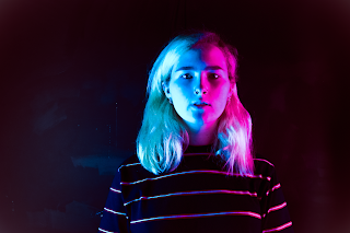
 As part of my experimentation phase I wanted to use my magazine cover test shots to come up with some examples of what my front cover could look like, experimenting with not only the styles i could create for a cover but also taking practise in the softwares i would be using for the real thing. I began with choosing very different images from my test shooting to show variation as i do not know which style of image i will use for my real front cover, i ensured to use two photos one with coloured filtering and one without.
To begin with i set about editing the basics of both images such as the brightness and saturation however before all of this, when opening my photoshop document i ensured to change the sizing of the document to the give myself a realistic idea of what i am working with, in this case A4 sized paper for printing. As most of the alternations i wanted to make were just enhancements of my original images, much like how i want to edit when it comes to my real magazine, i gave myself as much creative freedom as possible to enrich the colours of the images as well as play around with possible morphing techniques for the colour of my images, these were some of the possible images i came up with; As you can see, i did not do morph the images, i just enhanced what i already had, much like i plan to do with my actual magazine. I wanted to focus on enriching the colours of each photo therefore i mainly focus on editing the vibrancy and shadows of my photos as well as the split toning tool which really helped when editing my split toned images when using the coloured film over the lighting to shoot. Overall, i am really happy with how my editing went, it has opened my eyes to what i can do and how to find the correct balance without over editing an image or over saturating it.

 Once editing my images, i selected two of the images to create two example magazine covers, to do this i exported my images and opened my ready made photoshop documents of an A4 size and downloaded the font i have decided to use, as spoken about in my experimentation on font blog post. After exporting my images into photoshop i wanted to edit them further slightly, as it was just finishing touches i went onto the effect slide down down and selected the 'Auto' edit tool which touches up the images to give them a better quality, overall i really liked the touching edge it gave my images so it added it to both potential front covers. Next up i added in my title, i wanted to experiment coloured font however, as you will see i believe it gave my magazine an unprofessional finish therefore i will not be adding this into my magazine, I will just have to edit the darkness of my images so that text can be seen, i also edited the fill and opacity of my text to experiment with how this would help and yes, i believe it did. When it comes to editing my magazine I will not be as timid with the tool. After editing my image and adding in its title, i added in a barcode to add the magazine potential, overall i did not like adding it in as i believe it distracted from the image, the same could be said for content clues on the front cover, i did not like this therefore i did not add this into either of my potential magazine covers.
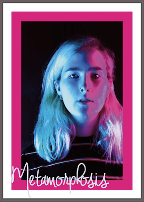
 After reflecting on my created covers, i wanted to take this on step further. I had seen a boarder around the outside some magazine front covers that i really liked, with the title above. I thought this was really effective and something i wanted to incorporate into my own magazine therefore leaving my two magazine covers above as is, i imported one of my images into InDesign to see if i could recreate some thing like this image; When using InDesign i ensured i included a slug and bleed as specified by my chosen print company which was 3mm. On reflection i am really happy with my way my experimentation went when it comes to adding a boarder into my work, it was simple enough to do without me wanting to break down and cry. As this image is just a mock up of how my cover could look, there are some imperfections however when it comes to editing my images for my magazine i will not be so lax about them.
By me creating a mock up of what my magazine could look like it has really pushed my understanding in software such as InDesign, i am happy with my basic understand which i can develop on through tutorials during college time but i have now practiced important techniques such as adding in Bleeds to the outside profile of my page layouts. In doing these mock ups it has also made me re consider important aspects of my cover shot such as insuring that i do use my white background as the dark background was extremely hard to work with when adding in fonts etc, it has also made me consider the types of shots i do. I must remind myself to keep the camera portrait instead of landscape to help myself fit the image onto the page without dis morphing the image, after creating my front cover i would also like to create a mock up of the inside of my magazine too. That way I can play around with layout and transporting documents from one software to another.


No comments:
Post a Comment