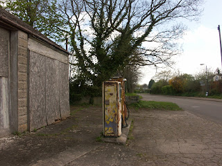
 Before beginning my photoshoot I must find locations suitable for my needs, as previously talked about it must be a woodsy area for the flare smoke to be effective however away from main roads and the general public, luckily the two conditions for my location scouting go hand in hand. Other variable's I need to consider are the amount of natural lighting there is, enough space for shooting and flare action and the viability for creating the correct atmosphere in am intending too. My first location search began in a small village not far from my local town, I considered this location as the old pumps looked like good props to incorporate into my shoot however due to the props being in the open I did not think that the natural lighting would work in my favour, I wanted the shoot to happen during dusk as there is still some natural lighting (enough to see) however it is still dark behind objects such as trees to give a gothic feel and I did not see using this location during the dusk period to work in my favour as I would need artificial lighting and there are no electricity sources surrounding the area. Another issue with this location is that it is on a main road therefore a health and safety hazard for those attempting to drive past due to the thick clouds of smoke that will be produced, finally due to this location being in a village there was little to no service therefore if an emergency was to occur we would have difficult contacting the emergency services. Accounting for all of the issues I found with this location I decided to not use it, I didn't want to risk others due to the potential of having an accident.
The next location I looked at was the wood area of a local fishing lake, I wanted to look at this location due to its wood location however upon discovery found that a lot of the woodland had been cut down due tree age. I decided to scout the location anyway to see if there was any potential for shooting, I found huts created with the sticks used from the cut down trees, I thought that this had a lot of potential for using due to the naturistic feel of them however due to the deforestation surround the area there was nothing above the huts and I was considered about the disturbance of nature if I was to set flares off in an area like this, this particular location was also very difficult to get too and so with camera equipment it would be even worse due to its isolated location. After debating further I made the choice to choose my last choice of location due to these locations risks, I thought that the risks outweighed the value of good location potential.
My finale location scout was a woods located near the Longleat forest, I fell upon this location by accident travelling home. Upon arrival I knew this was the location of my shoot, the symmetrical trees of this forest location really appealed to be from a photographer's perspective, not only this but the location was far enough from road to not be dangerous and also out of the publics way to not present a hazard. The location was not too far way from the car park to carry the camera equipment therefore less time would be wasted, as this forest was near to that of Longleat's land I wanted to ensure I would not be trespassing so once returning from the trip I went online and researched where the boarders of their ownership lay, unfortunately I found that this section of woodland was owned by Longleat however one of the top searches informs me that Heaven's Gate is open to the public 24/7 therefore I do not to be concerned. After finding this conclusion I have decided that this woodland will be where my shoot will take place.


