 Another piece of information I found interesting whilst doing my audience research was a graph found here; The graphic was broken down into multiple sections showing information like gender, age and children for me to get a clear understanding of iPhone buyers. I must bear in mind that these results were taken from the US and so must be taken with a pinch of salt but I feel like I can now understand the demographic I am aiming for here is those under twenty-five and I feel like as more males than females brought iPhones, I will aim my designs towards an under twenty-five, male audience. As I know the target audience I am wanting to reach now, I wanted to research more into what is popular within this demographic in terms of inspiration for potential phone case designs, from my understanding through research a lot of information I was picking out seemed to be based on gaming and graphic design, therefore when creating designs I will incorporate the two into my inspiration. When it comes to creating mock up designs, I will keep this in mind, Also, as I know that 117 of those who answered the survey, earn over £125K a year therefore, they are more likely to have an expendable income and so I can market my Iphone cases at a slightly larger price.
Friday, 3 November 2017
The business of publishing- Discovering audiences.
As part of this project, I decided I would like to create a line of mobile phone cases which would be marketed towards in-store and online retailers such as Etsy and Tiger. Once deciding what I would like to market, I began research into a target audience I think that would be appropriate for my product. I decided to create iPhone cases only, as on a whole I feel like there is a larger market for the public wanting to protect their iPhones due to their delicate sensibilities. I began to research into articles which comment upon iPhone users habits such as how much income they have to really understand how much I can sell my product on a very estimated guess on how much expendable income they may have, a Forbes article I found really interesting spoke about how there really wasn't any age difference between those who chose iPhones and who chose Android-powered phones, stating that 'Android people include more hard-core techies: they work in technical jobs and are more comfortable with the more open but less polished Android user experience. And they are less affluent, so the generally lower price of Android phones appeals to them more. iPhone people are a notch up the socio-economic scale: higher income, higher education, higher representation in professional and managerial jobs. They are tech enthusiasts, but more as consumers than producers.'
 Another piece of information I found interesting whilst doing my audience research was a graph found here; The graphic was broken down into multiple sections showing information like gender, age and children for me to get a clear understanding of iPhone buyers. I must bear in mind that these results were taken from the US and so must be taken with a pinch of salt but I feel like I can now understand the demographic I am aiming for here is those under twenty-five and I feel like as more males than females brought iPhones, I will aim my designs towards an under twenty-five, male audience. As I know the target audience I am wanting to reach now, I wanted to research more into what is popular within this demographic in terms of inspiration for potential phone case designs, from my understanding through research a lot of information I was picking out seemed to be based on gaming and graphic design, therefore when creating designs I will incorporate the two into my inspiration. When it comes to creating mock up designs, I will keep this in mind, Also, as I know that 117 of those who answered the survey, earn over £125K a year therefore, they are more likely to have an expendable income and so I can market my Iphone cases at a slightly larger price.
Another piece of information I found interesting whilst doing my audience research was a graph found here; The graphic was broken down into multiple sections showing information like gender, age and children for me to get a clear understanding of iPhone buyers. I must bear in mind that these results were taken from the US and so must be taken with a pinch of salt but I feel like I can now understand the demographic I am aiming for here is those under twenty-five and I feel like as more males than females brought iPhones, I will aim my designs towards an under twenty-five, male audience. As I know the target audience I am wanting to reach now, I wanted to research more into what is popular within this demographic in terms of inspiration for potential phone case designs, from my understanding through research a lot of information I was picking out seemed to be based on gaming and graphic design, therefore when creating designs I will incorporate the two into my inspiration. When it comes to creating mock up designs, I will keep this in mind, Also, as I know that 117 of those who answered the survey, earn over £125K a year therefore, they are more likely to have an expendable income and so I can market my Iphone cases at a slightly larger price.

Thursday, 19 October 2017
Typography project
The three main elements of our typography project were for it to be 3D have train tickets and photography incorporated, Amy and I had the word 'Get' twice, in order to created our display boards we used a disposable camera and travelled around Bath to create images with the context of our college and its surroundings. We also had a collection of train tickets provided to us which really helped with the 3D aspect of our project, to incorporate the commute most of us do every day into college. I believe this was also a was a strength of our project as it allowed the display board to really stand out from the others but also is easy to understand what we are trying to communicate without think too hard about it, as for weaknesses however, i fell like overall all the display boards had so many ideas added to it that there was not lot of flow to the whole quote, this was unfortunate. Another weakness of the project was that the fonts used were entirely the same, this was another let down to me as i feel like the display boards could have looked a lot better and more professional if it with the fonts used differently to adding to the idea that these were individual tasks. My opportunities during this project were really strong, we were lucky enough to have help from Nick (our project's supervisor) but also all of the tools and resources that we needed to give the project a good try such as the donation of cardboard but also Nick's feedback really helped to our ideas and how we could push ourselves to look individual. Finally the threats to our project were little to none accept one day of illness which really held back our project from sticking to a time schedule, we just worked as hard as possible and managed to get the project done in time. Another threat was the overall neatness of our work as the cardboard was difficult to cut out and made the project like amateur to what its worth could have been, i believe that others had this struggle too though so I am glad to know we weren't the only ones.

Overall, I really enjoyed the project and the creative freedom that was given to us. I would like to do a project similar if the opportunity was given to me as it can really help to build up my portfolio. Here is our final outcome;
I really liked the collage effect that we have created, it gives it the rustic feel with a scrap book edge we were looking for, both Amy and I contributed and created the boards together and equally.

Overall, I really enjoyed the project and the creative freedom that was given to us. I would like to do a project similar if the opportunity was given to me as it can really help to build up my portfolio. Here is our final outcome;
I really liked the collage effect that we have created, it gives it the rustic feel with a scrap book edge we were looking for, both Amy and I contributed and created the boards together and equally.
Wednesday, 18 October 2017
Evaluation of Portfolio and Presentation
Through the duration of Jo's brief we were set two particular tasks which really allowed the class to hit the ground running in terms of how we ended things with our FMP's last term, the brief also allowed us to be treated like practising media professionals ourselves by creating a working online portfolio and having to do a presentation on where we see ourselves in the future, what we are doing currently and how this will help us in for what lies ahead. The task we did first was to create a twelve month professional development action plan to present to the class, I found myself to have last minute jitters before heading up to present, however I find this when speaking in public everytime therefore I was not too concerned. Once up there I found my rhythm and really started to personalise what I was saying adding humor and light hearted jokes into the mix, like I do with speaking with most people. I tend to find that this style of personalisation really relaxes me as when I know that the jokes are flowing and everyone understands me if a form of subconscious acceptance and encourages me further, generally, I find myself enjoy the thought of working in a high pressured environment where work must be down soon and time is quickly running well, I keep my calm and tend to find that once the work is done, the reward is even more, well...rewarding! I am not one to be unprepared however, I may work best under pressure but I ensure to be through in my work to make sure that I do not shoot myself in the foot when standing up to speak, this attitude was very much applied when doing our personal development presentations as I found myself wanting to add more onto the slides just to ensure I didn't end up making any mistakes, luckily I didnt. My relaxed 'take things as they come' attitude may seem as a really strong skill to have, as it means that when i am working in a high pressured working environment I will strive for great things, yet I would really like to have more discipline with myself, working to a set time table even on days off to give myself some breathing time before having to present or even hand in work. If I was to present again, I feel like I would use less information on my slides and really just speak from what I am thinking, only using prompts to go on. However I had difficulty with this task anyway due to the fact that I feel like if I attempt to follow life by some sort of plan, then I will fail myself if that doesnt happen and trigger a lowering in my self esteem.
The next major project we had to do for Jo was create an online portfolio to send to potential employers, I made the conscious effort to use a website portfolio as I thought this would be the most sleek way. Squarespace, the website creating site I chose to use enables me to have a creative space where I can store all of my best work and also give me the freedom of a creative outlet to show employers what i can really do, I didnt want to section off any different pages within my website, yet just allow my work to be a variety merged in together, with captions for context underneath but also write, maybe about why i chose to take this image or why i decided to edit this piece of work. Creating my logo was another large section of this work and the one I created I absolutely love, since changing my name to Lola May I have received compliments on what a statement name it is, therefore I wanted to embrace and own it as part of my identity today and incorporate it into my own personal logo, I have written a separate blog post you can check out however in brief summary I created wild flowers in the 'L' of Lola as I have a large tattoo which can be seen often and it represents me really well. Overall, I am really enjoying adding to my portfolio, I am proud of how shes coming along because OH MY GOD SQUARESPACE YOU ARE THE MOST OVER COMPLICATED WEBSITE, but the sweat, tears and one mental breakdown were worth it. I am proud and will continue to work on her.
The next major project we had to do for Jo was create an online portfolio to send to potential employers, I made the conscious effort to use a website portfolio as I thought this would be the most sleek way. Squarespace, the website creating site I chose to use enables me to have a creative space where I can store all of my best work and also give me the freedom of a creative outlet to show employers what i can really do, I didnt want to section off any different pages within my website, yet just allow my work to be a variety merged in together, with captions for context underneath but also write, maybe about why i chose to take this image or why i decided to edit this piece of work. Creating my logo was another large section of this work and the one I created I absolutely love, since changing my name to Lola May I have received compliments on what a statement name it is, therefore I wanted to embrace and own it as part of my identity today and incorporate it into my own personal logo, I have written a separate blog post you can check out however in brief summary I created wild flowers in the 'L' of Lola as I have a large tattoo which can be seen often and it represents me really well. Overall, I am really enjoying adding to my portfolio, I am proud of how shes coming along because OH MY GOD SQUARESPACE YOU ARE THE MOST OVER COMPLICATED WEBSITE, but the sweat, tears and one mental breakdown were worth it. I am proud and will continue to work on her.
Primary and Secondary Research
 In order to collect primary research I decided to collect information by doing a survey on as many people as possible in the target audience for my project, for this this age range was anyone below 30 and above 16 as they are the main age range of festival goers', to do this I created a google survey and shared it out through my facebook friends (asking my mum and grandma to skip this one out) and allow for results to trickle in, I ensured to ask questions like 'Are you employed?' and 'Are you familiar with these celebrities?' To ensure that I was creating something my audience would want and also if they had the money to purchase the garment on offer, Overall, I feel like my survey was really successful thanks to the amount of feedback I received, on reflection I could have gone into the city and handed out a questionnaire or asked people if I could ask them questions, however I didnt really feel like harassing people in the street nor wasting either of our time with them being too young or too old or being interested in what I had to say. Once collecting my results, the statistics were overwhelming for me to look at therefore I created an infographic; As you can see the results are really interesting, with facts like 70% of those who answered my survey, were familiar with Town & Country, which I was not at the start of this task! Turning my results into an infographic really helped me to comprehend what I was going to do next in terms of the design and marketing process. Unfortunately, not much secondary research was done after this point, accept when it came to individual celebrity style moodboards, which can be found here.
Promotional Research on Target
Before creating any mock ups of potential designs to fit my re brand, i wanted to do some audience research on what they wanted, how much they were willing to spend and if they knew of the British Influencers I was going to use as part of my collaborative re brand. To do this i created a survey through google surveys, asking questions on top those previously planned things like if they were employed, to ensure i had all of the information necessary to allow my re branding to reach my target audience. I shared my survey through my 'friends' on facebook and got a fairly good response, I shared the post with nobody over the age of 30 to know my survey was reaching my target audience, this was fairly easy to do, i just ensured that my mum or grandma answered the questionnaire. My marketing strategy involves three main ideas, created around the five main p's of marketing;
- Product
- Price
- Promotion
- Place
- People
For me, using this strategy fell into place quite easily. My product is five sets of 'revamped' Town & Country wellington boots which will be individually designed for a British influencer, after everyone had answered my survey and most were employed and willing to pay £20-30 for wellingtons, I will market my wellies at £25 per pair, my promotion will be done through snapchat geofilters at main festivals such as Glastonbury to promote through word-of-mouth, another way I will promote my wellies is through pop up shops during the main festivals to really push the exclusivity I am aiming for, as this and buying online will be the only way to buy the wellies. Another way I will promote these wellies is through billboard and social media work with the five influencers together in one space, I also feel this will be effective as it is scene alot with other influencer X brand collaborations. As said previously, my product will mainly be sold during the festival season as this is when wellington boot sales really rise in the UK, with my collaborators Harry Styles, Jordan Bunker, Rita Ora, Cara Delevingne and Alexa Chung wearing them at the selected festivals to promote, allowing paparazzi to shoot them wearing the wellingtons and also using the promotional Snap filter together.
Visuals to communicate concept
To visually showcase the products I have created for my brand I have created mockups of what each wellington boot could look like. I wanted each design to be slightly different from the other in order to give myself the variation that the public could potentially want, therefore I created visual mood boards to under which aspect i was going to incorporate for each celebrity and how each design would differentiate from one another, as you can see from the mood boards I selected an individual stylistic piece and put focus on it and similar aspects they have worn. Once designing mood boards to have a solid understanding of how I would design and differentiate between each style of wellington boot, I went about creating mock designs of the shoes.


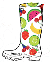
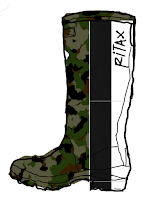


Lastly, I created an infographic to visually represent my survey findings for my presentation. To do this I created a Prezi presentation account and used a mixture of graphics and visual representatives to show my findings.


After having mock ups of designs down, I created potential marketing mock ups of how I would like my product to me sold. This included a logo, a billboard mock up and a n Snapchat GeoFilter.


Lastly, I created an infographic to visually represent my survey findings for my presentation. To do this I created a Prezi presentation account and used a mixture of graphics and visual representatives to show my findings.
Monday, 16 October 2017
Logo
For this assessment in the brief, I wanted to create a logo which was simplistic and monochrome yet still image based, As i have a large flower piece tattooed on my shoulder that distinguishes me I wanted to incorporate some of this into my logo design, as i believe this accurately represents me. To do this, I began researching into small flower wild flower designs to maybe put under my logo as an inlining or something, however I stumbled upon a twisted wild flower image that really stood out to me as an 'L' shape therefore I exported the image into photoshop and traced around it. After finishing the 'L' to incorporate the image based idea I wanted from my tattoo, I found a font i really liked and exported it into Photoshop also. Ensuring that the font fitted with my wild flower 'L', i was happy with my overall design and thought it expressed myself in a minimalistic and effective way to add into any portfolio work or online websites.


Wednesday, 11 October 2017
Interviewing a media industry professional; Anthem Publishing
Overall, my experience with visiting Anthem Publishing was a really positive one. The women who gave up their time to educate and inform us seemed to want to encourage our knowledge not only their company but the publishing industry itself, it was really refreshing to have a warm welcome as students intruding on their workday, no question was too big but they also wanted to ensure we had all the information needed to carry out our write-ups. Three of the most important things I learnt whilst speaking to the digital edition and marketing assistant were probably not about the industry itself, but how to get into their position. One of the main points was that a portfolio or work experience was very necessary in order to get onto the job ladder, two examples they offered to us were that blogging allowed the digital editor to gain her position as the company through being able to prove her tech-savvy skills, another example offered was the marketing assistants work experience through the company during the summer which then allowed her to gain entry into a full-time position for the job she is in now through the same company, which was the best outcome for her. Another interesting piece of information I learned was that although a university degree isn't demanded, it is really helpful in order to climb the job market at a faster pace, they also told us that if any of wanted to work overseas in the US for example; then it would be expected of us to have a degree therefore in order to not limit myself I must pursue a degree. Finally, the last thing I found interesting from our interview was that their sales of print magazines are doing better than ever, which really surprised me as there is such an emphasis on print 'dying' but that Anthem publishing are constantly evolving their online presence when it comes to digital magazines, personally i would like digital magazines to becomes more interactive with the readers such as through video content and hyperlinks to other sections of the magazine, etc.
Finally
PT 1
PT 2
Finally
PT 1
PT 2
Thursday, 28 September 2017
Display Board Concepts
 For this display project we have decided upon three original ideas sourced from other creative members of our class to created a visually pleasing display of the quote 'It doesn't get easier, you just get better.' with the main focus of the brief being that the idea must be 3D or at least able to be translated into 3D once the artwork is finished. Before selecting our finale ideas to work with, each individual member of the class needed to create their own interpretation and idea to suggest to the class. My Idea was to use images sourced by those within in our class from our projects from the previous year however whilst i waited for those images to come through, I created a mock up of my potential idea. My influence for came from my research on the graphic designers Craig and Karl who use modern pop art for different cliental, overall i really liked their use of bold colours and imagery to portray their imagery therefore i incorporated this into my own ideas. After reflection on what i had created as a mock up, i found it difficult to think of a way to tie in the 3D point from the brief, therefore my idea was not chosen.
 As a class, after finishing our designs, we tied together what we had learnt to decided on three main ideas we liked the idea of. First was Oscars who incorporated Imagery into photography and typography into one main idea, i really liked this idea as it was similar to mine. Brandon's Idea was the second idea we had chosen to work with as he used different forms of patterning and shapes to manipulate typography in a pop art way, much like that of Craig and Karl. Finally, the last idea we decided to work with was Angel's who wanted to incorporate textures into her lettering to ensure it would stand out on the board, using train tickets as use of material of choice because that is how most people get into college.

Monday, 25 September 2017
Marketing Strategy
Five P's of marketing

- Product (What are you selling?)
- Price (How will you market your price, research price ranges?)
- Promotion (Where, When, How and Why?)
- Place (Where?)
- People (Who will best fit your brand? Who will reach your target audience?)

Monday, 18 September 2017
Town and Country Rebranding pt 1
Reasons why research is important;
1) Allows you to understand your target audience and how to reach them
2) Gives you background knowledge on the brand
3) Inspiration
4) To see trends and most popular items from the brand
5) Competitors, seeing what the brand is up against
Types of research
Primary research- research performed by yourself like a survey, focus groups.
Secondary research- research performed by others like internet research, books.
Town and Country Rebrand;
Town and Country began to manufacture and design leather based goods in 1960, since then the company has focused their attention on farming and agriculture side of their business, stating on their website that 'our focus has been on bringing innovation to the gardening sector with a range of gloves and footwear that combines quality, functionality and style, with a price tag that represents exceptional value for money.' Today, T&C has claimed to be one of the country's leading gardening brands who allege that they offer 'one of the most comprehensive collections of gardening gloves and footwear'. Having put their put through the door in 1997 when beginning the production of footwear T&C have continued to invest in their footwear ranges and hope to in the future.
Research
 From my research i have found that, currently the target audience for T&C is middle aged to older men and women, i can tell this by the promotional pictures adverting their goods through the website. The website also heavily features a lot of the outdoors, which is to be expected with a company who sells outdoors footwear and equipment. To me this suggests that the company is also trying the each audiences over the age of 65 as it is a well known fact that this is retirement age therefore those older than this will have the time for things like gardening and so will want to buy the goods from places like T&C, another observation i have made from the brand is that the prices are high for the goods provided, showing to me that they have a customer base and those they want to reach must have a lot of expendable income to spend of things like wellies, hence why is suggest that there is a middle class vibe towards the brand. From my research i found that alot of the products also used gender neutral tones and earthy tones which i will keep in mind when it comes to the rebranding as i believe it is beneficial to keep things gender neutral to reach larger audiences but also how i can re brand the items on sale with changing colour schemes and styles.
For my research i will perform both primary and secondary research before beginning my re brand, most of my primary research will be very active including going to visit my closest distributor of T&C footwear and inviting them to answer my questions such as what styles sell best and who buys them, using questionnaires to identify what my target audience would want from the rebrand, asking questions such as who influences you style wise but also things like occupation to understand how much my target audience are willing to pay. In doing these questionnaires i can get a full understanding of how and what will make my rebrand successful and my research i conduct will hopefully back this up. As for secondary research i will use the blogs and information provided to me through the T&C website as their information will be most correct, i will also use google and other factual providers to benefit my factual profile on T&C.
My idea
 My Idea is to rebrand Town and Country for a younger audience for a festival scene, due to this my target audience will be those over the age of 16. When festival season starts the sale of wellies sky rocket, in 2015 Ebay the e-commerce giant gained a 40% surge in the sales of waterproof garments before Glastonbury, with key searches being 'fashionable' and 'waterproof' together. By brands such as T&C tapping into consumers interest during the festival period, they can profit on the uncertain weather Britain seems have. My intention is to create a line of wellies for the festival season and to promote each design through a collaboration of a well known celebrities, preferably those who is well known in the for appearances at festivals in both the US and UK such as Coachella and Glastonbury. Over the past five years there has been a surge in brands creating festival inspired fashion lines such as H&M X Coachella and other online British clothing companies such as Boohoo, Miss guided and ASOS also selling festival inspired pieces, during my research I also noticed that men were also targeted during the festival promotions.


Thanks to this research that suggests both men and women are targeted during the festival season, I will ensure that my collaboration will include both women and men influencers. I have made the choice to use two male influencers, currently i believe i will use Harry Styles and Jordan Bunker as one is well known in the music industry and the other well known in the fashion industry which i believe will benefit me as both influencers intertwine the two markets i am trying to reach. I have used the same method when selecting my female influencers, choosing to use three to model for re brand. The three female influencers i have chosen to use are Alexa Chung, Cara Delevingne and Rita Ora. I plan to use these influencers in multiple ways, the first i will do this is by naming at least one of my boot designs after one of the influencers, because of this i will be design five different styles of welly boots, each separate design reflecting the style of the influencer. For example; Rita Ora's will be flamboyant and named 'The Rita.' In order to do this entire process i will begin by creating individual mood boards of reach influencers style, begin to sketch out ideas and researching patterns and colours that could be used before then transferring all of this information into photo shop and creating my finale designs. Once i have completed my design work i will processed to think about how i could potentially promote my wellies, currently my idea would be a meet and greet situation where my influencers could meet those who buy a certain pair. Another Idea i have on how i could promote this is by ensuring photo opps are taken with them in the wellies during a festival scenario.
1) Allows you to understand your target audience and how to reach them
2) Gives you background knowledge on the brand
3) Inspiration
4) To see trends and most popular items from the brand
5) Competitors, seeing what the brand is up against
Types of research
Primary research- research performed by yourself like a survey, focus groups.
Secondary research- research performed by others like internet research, books.
Town and Country Rebrand;
Town and Country began to manufacture and design leather based goods in 1960, since then the company has focused their attention on farming and agriculture side of their business, stating on their website that 'our focus has been on bringing innovation to the gardening sector with a range of gloves and footwear that combines quality, functionality and style, with a price tag that represents exceptional value for money.' Today, T&C has claimed to be one of the country's leading gardening brands who allege that they offer 'one of the most comprehensive collections of gardening gloves and footwear'. Having put their put through the door in 1997 when beginning the production of footwear T&C have continued to invest in their footwear ranges and hope to in the future.
Research
 From my research i have found that, currently the target audience for T&C is middle aged to older men and women, i can tell this by the promotional pictures adverting their goods through the website. The website also heavily features a lot of the outdoors, which is to be expected with a company who sells outdoors footwear and equipment. To me this suggests that the company is also trying the each audiences over the age of 65 as it is a well known fact that this is retirement age therefore those older than this will have the time for things like gardening and so will want to buy the goods from places like T&C, another observation i have made from the brand is that the prices are high for the goods provided, showing to me that they have a customer base and those they want to reach must have a lot of expendable income to spend of things like wellies, hence why is suggest that there is a middle class vibe towards the brand. From my research i found that alot of the products also used gender neutral tones and earthy tones which i will keep in mind when it comes to the rebranding as i believe it is beneficial to keep things gender neutral to reach larger audiences but also how i can re brand the items on sale with changing colour schemes and styles.
 For my research i will perform both primary and secondary research before beginning my re brand, most of my primary research will be very active including going to visit my closest distributor of T&C footwear and inviting them to answer my questions such as what styles sell best and who buys them, using questionnaires to identify what my target audience would want from the rebrand, asking questions such as who influences you style wise but also things like occupation to understand how much my target audience are willing to pay. In doing these questionnaires i can get a full understanding of how and what will make my rebrand successful and my research i conduct will hopefully back this up. As for secondary research i will use the blogs and information provided to me through the T&C website as their information will be most correct, i will also use google and other factual providers to benefit my factual profile on T&C.
My idea
 My Idea is to rebrand Town and Country for a younger audience for a festival scene, due to this my target audience will be those over the age of 16. When festival season starts the sale of wellies sky rocket, in 2015 Ebay the e-commerce giant gained a 40% surge in the sales of waterproof garments before Glastonbury, with key searches being 'fashionable' and 'waterproof' together. By brands such as T&C tapping into consumers interest during the festival period, they can profit on the uncertain weather Britain seems have. My intention is to create a line of wellies for the festival season and to promote each design through a collaboration of a well known celebrities, preferably those who is well known in the for appearances at festivals in both the US and UK such as Coachella and Glastonbury. Over the past five years there has been a surge in brands creating festival inspired fashion lines such as H&M X Coachella and other online British clothing companies such as Boohoo, Miss guided and ASOS also selling festival inspired pieces, during my research I also noticed that men were also targeted during the festival promotions.

Thanks to this research that suggests both men and women are targeted during the festival season, I will ensure that my collaboration will include both women and men influencers. I have made the choice to use two male influencers, currently i believe i will use Harry Styles and Jordan Bunker as one is well known in the music industry and the other well known in the fashion industry which i believe will benefit me as both influencers intertwine the two markets i am trying to reach. I have used the same method when selecting my female influencers, choosing to use three to model for re brand. The three female influencers i have chosen to use are Alexa Chung, Cara Delevingne and Rita Ora. I plan to use these influencers in multiple ways, the first i will do this is by naming at least one of my boot designs after one of the influencers, because of this i will be design five different styles of welly boots, each separate design reflecting the style of the influencer. For example; Rita Ora's will be flamboyant and named 'The Rita.' In order to do this entire process i will begin by creating individual mood boards of reach influencers style, begin to sketch out ideas and researching patterns and colours that could be used before then transferring all of this information into photo shop and creating my finale designs. Once i have completed my design work i will processed to think about how i could potentially promote my wellies, currently my idea would be a meet and greet situation where my influencers could meet those who buy a certain pair. Another Idea i have on how i could promote this is by ensuring photo opps are taken with them in the wellies during a festival scenario.
Subscribe to:
Posts (Atom)
Show Evaluation
Overall, I believe that our final show was successful in some ways, however, in others let down. Let's begin with the overall communicat...

-
 As part of the brief, Steve wanted us to do a reflection piece on what we have learnt from the target audience, a creative piece. Due to thi...
 -
Film uses camera shots to change the way an audience would perceive a certain scene in a film, the more close up and quick changing the angl...
